ListView
A scrollable list of controls arranged linearly.
ListView is the most commonly used scrolling control. It displays its children one after another in the scroll direction. In the cross axis, the children are required to fill the ListView.
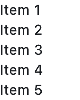
Basic list view
Inherits: LayoutControl, ScrollableControl, AdaptiveControl
Properties
-
build_controls_on_demand(bool) –Whether the
controlsshould be built lazily/on-demand, i.e. only when they are about to become visible. -
cache_extent(Number | None) –The viewport has an area before and after the visible area to cache items that are about to become visible when the user scrolls.
-
clip_behavior(ClipBehavior) –Defines how to clip the
controls. -
controls(list[Control]) –A list of
Controls to display inside ListView. -
divider_thickness(Number) –If greater than
0thenDivideris used as a spacing between list view items. -
first_item_prototype(bool) –Whether the dimensions of the first item should be used as a "prototype" for all other items.
-
horizontal(bool) –Whether the
controlsshould be laid out horizontally. -
item_extent(Number | None) –A fixed height or width (when
horizontalisTrue) of an item to optimize rendering. -
padding(PaddingValue | None) –The amount of space by which to inset the
controls. -
prototype_item(Control | None) –A control to be used as a "prototype" for all items, i.e. their
heightorwidthwill be the same as theprototype_item. -
reverse(bool) –Whether the scroll view scrolls in the reading direction.
-
semantic_child_count(int | None) –The number of children that will contribute semantic information.
-
spacing(Number) –The height of divider between the
controls.
Examples#
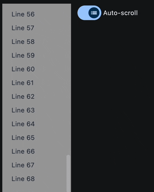
Auto-scrolling and dynamical items addition#
import asyncio

import flet as ft


async def main(page: ft.Page):
    def handle_switch_change(e: ft.Event[ft.Switch]):
        lv.auto_scroll = not lv.auto_scroll
        page.update()

    lv = ft.ListView(
        spacing=10,
        padding=20,
        width=150,
        auto_scroll=True,
        controls=[
            ft.Text(f"Line {i}", color=ft.Colors.ON_SECONDARY) for i in range(0, 60)
        ],
    )

    page.add(
        ft.Row(
            expand=True,
            vertical_alignment=ft.CrossAxisAlignment.START,
            controls=[
                ft.Container(
                    content=lv,
                    bgcolor=ft.Colors.GREY_500,
                ),
                ft.Switch(
                    thumb_icon=ft.Icons.LIST_OUTLINED,
                    value=True,
                    label="Auto-scroll",
                    label_position=ft.LabelPosition.RIGHT,
                    on_change=handle_switch_change,
                ),
            ],
        )
    )

    # add a new item to the ListView every 1 second
    for i in range(len(lv.controls), 120):
        await asyncio.sleep(1)
        lv.controls.append(ft.Text(f"Line {i}", color=ft.Colors.ON_SECONDARY))
        page.update()


ft.run(main)
Properties#
class-attribute
instance-attribute
#
build_controls_on_demand: bool = True
Whether the controls should be built lazily/on-demand, i.e. only when they are about to become visible.
This is particularly useful when dealing with a large number of controls.
class-attribute
instance-attribute
#
cache_extent: Number | None = None
The viewport has an area before and after the visible area to cache items that are about to become visible when the user scrolls.
Items that fall in this cache area are laid out even though they are not (yet)
visible on screen. The cache_extent describes how many pixels the cache area
extends before the leading edge and after the trailing edge of the viewport.
The total extent, which the viewport will try to cover with children, is
cache_extent before the leading edge + extent of the main axis + cache_extent
after the trailing edge.
The cache area is also used to implement implicit accessibility scrolling on iOS: When the accessibility focus moves from an item in the visible viewport to an invisible item in the cache area, the framework will bring that item into view with an (implicit) scroll action.
class-attribute
instance-attribute
#
clip_behavior: ClipBehavior = HARD_EDGE
Defines how to clip the controls.
class-attribute
instance-attribute
#
A list of Controls to display inside ListView.
class-attribute
instance-attribute
#
divider_thickness: Number = 0
If greater than 0 then Divider is used as a spacing between list view items.
class-attribute
instance-attribute
#
first_item_prototype: bool = False
Whether the dimensions of the first item should be used as a "prototype" for all other items.
If True, their height or width will be the same as the first item.
class-attribute
instance-attribute
#
horizontal: bool = False
Whether the controls should be laid out horizontally.
class-attribute
instance-attribute
#
item_extent: Number | None = None
A fixed height or width (when horizontal is True) of an item to optimize rendering.
Note
This property has effect only when build_controls_on_demand
is True or spacing is 0.
class-attribute
instance-attribute
#
padding: PaddingValue | None = None
The amount of space by which to inset the controls.
class-attribute
instance-attribute
#
prototype_item: Control | None = None
A control to be used as a "prototype" for all items, i.e. their height or width will be the same as the prototype_item.
Note
This property has effect only when build_controls_on_demand
is True or spacing is 0.
class-attribute
instance-attribute
#
reverse: bool = False
Whether the scroll view scrolls in the reading direction.
For example, if the reading direction is left-to-right and
horizontal is True,
then the scroll view scrolls from left to right when reverse is False
and from right to left when reverse is True.
Similarly, if horizontal is False, then the scroll view scrolls from top
to bottom when reverse is False and from bottom to top when reverse is True.